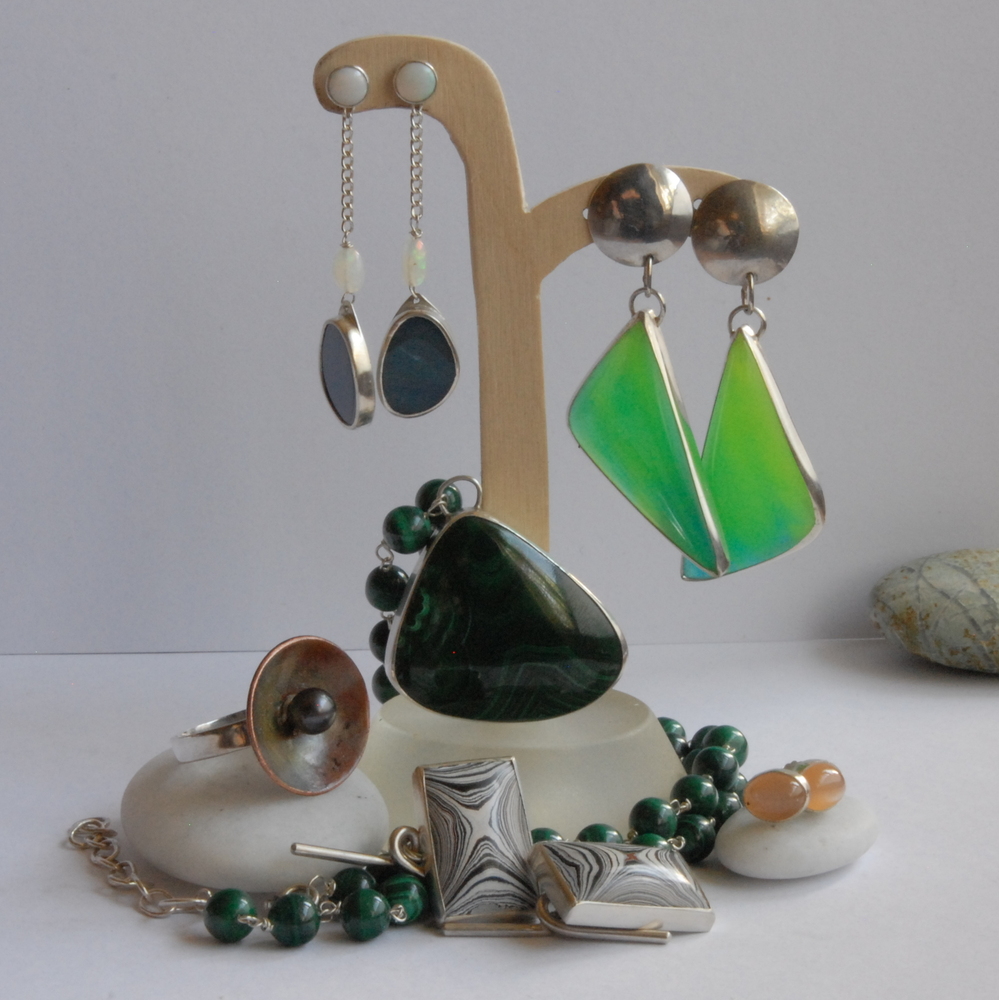
Every July I take part in my local open studio scheme, I get one photo in the physical guide (more are online but most people seem to still go with the 80 odd page guide) and since I have to submit the photo in January when the weather/ lighting is against me I’m taking some now. The image in the guide will be 1 1/2 inches square and I get about 2 sentences to go with it. I know the lighting isn’t right and the positioning of the pieces needs tweaking but as a general grouping/ composition which of these would make you come and visit my studio
Is there something else in my shop that you think I should include instead? I wonder if some of the blown glass earrings should be included.
Thoughts please - getting it wrong can have a drastic effect on visitor numbers so I need to get it right.
Not sure why but I think I prefer the second photo - somehow the pendant between the earrings in the first one doesn’t look right to me. If you wanted to add more you could maybe put some studs in front of the pebble on the right.
I think the second photo seems unbalanced, with a pair of dangly earings and a shorter pair, I like the shorter earings best and another pair in maybe a different colour would look good. But I am by no means an expert at all. With shorter earings as the ones on the right, on both sides then would a pendant look better between them, but reaching to the top of the stand. Your earings are lovely by the way.
Thanks for the input ladies, keep it coming. I thought I prefered the first photo (colour grabs the attention) but at the moment the second photo is getting more love on facebook as well. I can see myself spending lots of time running up and down the stairs as I swap pieces on the display stands, take photos (downstairs) and then look at the on the computer (upstairs). I’ll be back with more/ different options later…
hi - i prefer the second as i like the way the colours work together. also i am not sure about the pendant between the two green earrings in the 1st photo - i like the two sets of earring together in the second better.
(I’d sold the earrings via folksy before the open studios began but sold the pearl necklace during the event to a personal stylist who left with extra business cards!!!)
instead of the beaded necklace (but depends on the age profile of the customers). I also like your copper pendants, which show a different style. (But that might be because I’m working on a lot of copper at the moment )
Blast earrings! They’re so difficult to display effectively. I like the second shot the best because splitting the earrings with the pendant in the first makes them look less like earrings-It sounds strange, but you catch my drift?
Righto let me solder a bail on and then I’ll go and rummage through the stock and see what I can come up with - thus far the beaded necklaces have proven more popular than the frame style pendant (I’ve done the open studios for 3 years now) but I could put a frame pendant in instead of a cabochon one… I always knew this woud be an iterative process and your feed back is very much appreciated.
(@SamanthaStanley I know what you mean about earrings not looking like earrings, a particular problem with those bowlerite ones because of the size of them as they could easily be pendants thankfully bowlerite is light)
I much prefer the composition of the second shot - it takes my eyes around the whole range of items and they look good together. My only doubt is in the colours - it needs a pop of something brighter (instead of the black ones perhaps?). Your revised version of it looks too crowded to me. Good luck deciding!


 )
)