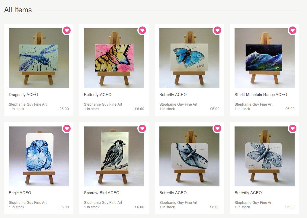
I’ve been stock taking (boo) and reviewing my photos this week. I’ve had a good hard look at my shop and I think I need to unify my photos. I’ve got this VERY wrong in the past so would be hugely grateful if you’d give me your opinion on these photos for my ACEO section.
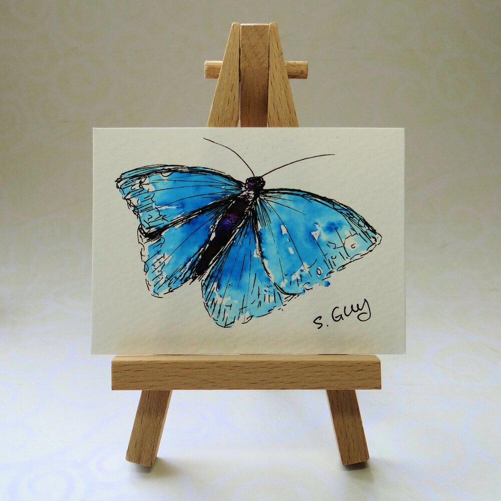
I’ve tried to give them an infinity background by bending the paper rather than having a fold, and I’m using an LED daylight lamp to boost the light levels.
I don’t want to use a white background as several of my mini paintings are on white paper so the edges would get lost. I’ve used a very pale matt gold/yellow here. I’m a bit concerned that the light is shining off the lower part of the paper a bit too much, even though I’ve angled the light towards the back.
All comments and advice gratefully received, I’m looking for brutal honesty!
1 Like
They look clear and really focus on the paintings, prefer the ones without the stamp as it detracts from the artwork. That might be due to the colour of the stamp? Could you perhaps try using coloured pencils/pens/brushes for scale and co-ordinate the colours with the artwork? Like the lighting on the background base, any way you could get the top of the background a little lighter?
We have the mammoth task of redoing our pics some point this year so know just what you are going through. The quest for the best lighting will no doubt have us pulling out our hair 
1 Like
I’m certainly no expert - I really struggle with photos, but I think these look fantastic. The background is interesting without being distracting and I like the effect of it being lighter at the bottom as it adds depth to the photo. In my humble opinion I think you’ve nailed it.
1 Like
Thanks I’ll have a play with different scale items and think about the lighting some more, I could maybe try adding a reflector.
1 Like
My infinity curve has a lid to it - this stops all the light coming in from the top causing the base to look brighter than the back drop. The lid is white card so I can bounce light off it if need be. Might be worth a try. I’ll admit that I normally focus my efforts of getting my jewellery appropriately lit (reflective surfaces, gems with optical effects, high contrast between silver and black stones argh) so my backdrops can look a bit varied and this is something I plan to work on after my summer shows.
1 Like
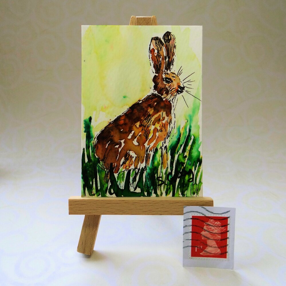
I agree with @littleRamstudio. The stamp is red and red has a strange psychological effect when it appears in a photograph. I draws the viewer’s attention like no other colour. Try using one of the gold coloured stamps which will tone in with the wood on your easels.
Love Sam x
1 Like
Oooh Sasha @SashaGarrett that is something that would never have occured to me, I’ll give it a go.
Sam @SamanthaStanley a gold stamp is a fab suggestion! I’ll go and raid my daughters stamp collection to see what I can find.
1 Like
hi there -
the photos look clear and crisp but do you need to have stamp? perhpas just have the painting to focus solely on that- also possible lighten background/maybe a plainer light coloured background. just some thoughts.
just a thought - but could you have a paintbrush or something related to painting as a scale indicator - ? so it acts as a prop also.
1 Like
I think they are lovely and clear, just wondering if one of your grandfathers ink dip pens would look good as a prop? can’t remember if they were wooden? am thinking the softer wood colour would not detract from the painting as well as being a ‘tool of your trade’ so to speak
1 Like
If they were mine, I’d crop them down even more, I know you need to be square, but that’s what I’d do! And in my other photos, I’d get up really close to the wonderful painting, hope you don’t mind me chipping in 
1 Like
Hi Steffie, I think that the photo look fab! I think that the photo’s are cropped just right and I love the light at the front of the shot, I think it makes your paintings look great. Not sure about the stamp, like the other’s have said a paintbrush would be great idea. Love them! 
1 Like
Love the photo’s hate the stamp!!!
1 Like
The photo’s are looking good Steph, I like the graduation of light but maybe the top section could be a tad lighter, I don’t mind the stamp but as others have said it may be better in a different colour, I’ve sometimes used a 20pence piece standing on edge.
I do use paint brushes as props to give a sense of scale but you can get so many different sized brushes it’s not always easy to tell the size. Often pens or pencils work well because they are more of a standard size.
1 Like
Lovely photos, but I agree with a lot of the comments about the stamp. It is quite distracting.
I think finding natural props which relate to your gorgeous artwork would look so much nicer.
Karen x
2 Likes
Hi I have just been on your site and think your work is lovely .
The hare I love , but not the stamps.
1 Like
Thank you so much for all the comments, I really do appreciate it.
There’s a definite theme forming - ditch the stamp and bring in some more relevant props for sizing. I will also include a photo of just the painting as a supplementary, and I have a photo of my packaging as another supplementary, although that too needs updating and fitting in with the general style.
I’m interested to hear that some of you think the light at the bottom adds depth.
One person over on facebook has suggested using a black velvet cloth as a background as that won’t reflect any light at all so I might try it if I can cadge some velvet from one of my local friends.
1 Like
Have you tried using the same colour for the background but plain rather than that swirly pattern? I’m just wondering if that’s what’s making the lighting a bit too bright at the bottom.
Lovely clear, sharp images. And one more vote for losing the stamp.
1 Like
I think they look brilliant and would say the ones without the stamp would be my top pick (perhaps the stamp ones could be your 2nd picture as it does give a good indication of size). At the beginning of the year I read an awful lot about product photos (I’ve forever striving for that “perfect” look - long way to go!!) and several articles suggested a slightly grey background was far more pleasing to the eye than a stark white. I think you’ve hit the jackpot with your pics Stephanie.
Elaine
1 Like
I have collected a few things over time that I can use for props, I have a plastic tub that I keep a few bits in, acorns, feathers, autumn leaves, shells etc, I also have a few jelly tots and cake sprinkles. It’s nice to match up the props to the subject matter. I sometimes use whatever flowers are in the garden at the time.
I’m not too sure about black velvet, it may be a bit harsh, grey or cream may be the better option.
1 Like
Thank you for all your help 
My shop is taking shape now, I really like the unified feel with no distractions from the artork.
For my secondary images, I tried pens and pencils, a wooden dip pen, and various other items but didn’t like the cluttered feel so I went for the gold stamp.
The other secondary images are the whole painting with no easel, and then various close up crops.
My final image is one of my packaging which I still need to update as it really doesn’t fit the theme.
It will take me months to update all my photos but I’ve set a goal of at least 2 per day. I’ll get there!
Thanks again for your help 
3 Likes