
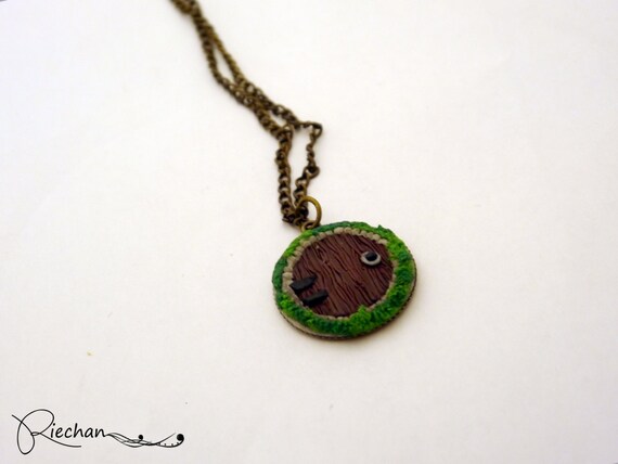
Since it is a bag charm or key ring how about staging it attached to either a bag or keys? At the moment the photos don’t suggest ‘baby’ either (I know its not meant for a baby but the setting does not suggest that it is a baby) so maybe a few ‘baby’ props (dummy/ small chunky toy that sort of thing).
Mind is boggling slightly wondering what you were planning on making…
Sasha
1 Like
Thanks Ronald! That sounds like a good idea-Photography is such a complicated business. Making jewellery is simple by comparison 
Sam 
Thanks for your suggestions. I will try a few more things when I get good light and see how I can improve it. I’m certainly pleased someone recognises this as a baby  I was trying to make a little Easter bunny…!
@hobbitgirlie1880 You don’t have to relist, just edit the listing and change the photos.
Thanks Ron, I’ve got so much to learn. Not too sure how to do insets so I guess that’s another for the to do learning list Lol xx
Thanks, I will try some experiments when I get some time but need to do some tidying up as I have piles of stuff everywhere! Can’t wait to play xx
last product crits were good, heard different opinions what I wouldn’t even thought about so changed that listing. But not sure about this one. I prefer the one from sife angle, but didn’t really attract anyone, didn’t get any views, so I’ve just changed to the one which is now the main pic. Which one you think works best? many thanks
From a thumbnail point of view I prefer the second photo, you can instantly see what it is without having to look too hard.
Lots of deep shadows on the linked image, a pity, as looks an interesting and very unusual object.
Not saying that shadows are bad always, but as Stephanie says, you have to look hard to see and define the object. You can soften some of the shadows with a white card reflector, or white sheet.
The shot against red is much better as regards seeing what the object is, great contrast and impact.
I think with a bit of work on softening the shadows, the other one could be great too.
Take a leaf out of professional filmmakers and photographers technique, and try using simple reflectors to bounce the light around, and reduce deep shadows.
Or use a Ringflash which eliminates most shadows.
Ron
Feedback please? As on Folksy we do not get many sales, compared to other online sites? Is the issue my photos…


Sarah/Luke,
The first shot is low contrast, the frame and surround almost a shade of grey. Was that your intention ? I think there is a fine balance to be had as regards having a bright white surround and the main image. Bright and dazzling isn’t always so great, so I, like you, sometimes tone down the surround to soften it.
But as customers would be viewing for purchase, it’s important to show what they will receive. So, maybe there could be a little more contrast to the first item. Look at the original and work out whether your image of it really reflects the tonal balance, or not.
The image can become a lot more ‘punchy’ with improved ‘levels’ and contrast tweaked in software. That makes the design and text stand out more.
Not sure if you take your pictures using natural daylight or have considered diffused electronic flash. You can get softboxes for flashguns which give nice, diffused lighting, but may need to experiment. I use a sort of ‘ringflash’ sometimes, and can get shadowless lighting with care. But you don’t have to go down that route, and big white card reflectors can be useful too.
The second image relies on the background to show off the tree silhouette.
Again, I would tend to bring up the levels and contrast a bit. On software like Photoshop elements and others you can see a simple graph of the tonal balance as you change settings, which helps. In my view, there needs to be more contrast between the frame and tree and the background. That would bring out the tree and frame more.
In essence that would make the black appear blacker, and the background a little lighter. I like the out of focus background, which works well.
You could do a second shot also of a bit of a close-up of the dog and bottom text assuming the detail is there.
Ron
I absolutely hate taking product photos. My brother has taught me how to use the white balance as with my items I think it’s important to show the colours as true as possible. I don’t have any young children in the family who could model. I did used to use a lifelike doll for my baby items but quite a few people said they would rather see knitting just laid out flat so they get to see more of the detail. I take my photos outside without a flash or lights and try not to get in full sun.
This is my latest listing and you can be honest!
Here is one of mine. For the white backgrounds, I use a handmade light box, then photoshop and then fotofuse to make the background lighter and the colours pop. For the book background, I just use a book and no light box. The rest is the same. What do yo think?
1 Like
Hi everyone
Please can someone give me advice on this items photos
https://folksy.com/items/6672995-Teacher-thanks-bookmark-
I can’t seem to get them right
1 Like
Hi Dawn @hobbitgirlie1880
I’m no expert on this photography lark, I’m still trying to get it right myself. I probably spend more time taking snaps than actually making stuff.
Your teacher bookmark would look lovely with a book as a prop, maybe a personal organiser. (A dummy book would be great as I don’t think we can use an actual book with the cover on show due to copyright issues. I’m sure someone will correct me if I’m wrong.
The photo looks quite cold and washed out. Maybe use some editing software to add abit of warmth. I find if I’ve brightened a photo it can sometimes bleach out the colours so I fiddle about and get the colour of the item back and also have a brighter photo.
I hope this helps
Karen
1 Like
Hi Hobbitgirlie,
Its very soft focus in all the photos - no part of the photo looks pin sharp so I suspect that your camera is having to use a longer exposure to compensate for low light levels and you are picking up a bit of camera shake as a result. Could you move closer to the window/ light source and put a reflector (bit of white card or tin foil) on the opposite side to bounce light into the shadows? That would help increase the light levels and so reduce the exposure time and resultant shake. (Or you could use a tripod if you have one but not everyone does).
Also the cloth backdrop needs smoothing out a bit more - there is the odd wrinkle which is distracting.
Hope that helps
Sasha
1 Like
I don’t think showing a book in a photograph contravenes copyright Karen, because you’re not selling it or suggesting you are affiliated with it. But I might be wrong. If in doubt though, use a book that’s out of copyright (copyright lasts for 70 years after the author has died). A vintage book would probably suit your work better anyway @hobbitgirlie1880.
1 Like
Thanks Camilla @folksycontent
Oh ok… That’s good to know. Im always scared stiff of stepping into the glooms of copyright issues. 
Karen
Thanks Karen @karenscraftybitz
I think I was so worried about getting all the words in focus I didn’t really think about the colour.
I’m going to keep fiddling. Because in alhonesty I’m not that happy with quite a few of my photos.
But this bookmark is being the biggest pain.
When you say use props. I did use a book in one of the pictures I think it’s picture two

How’s that look?
Thanks @SashaGarrett I will try getting closer to the window.
And try the white card.
I know what you mean about the sheet.
I’m going to look for a piece of grey card.
I asked for help on a different thread and grey card was suggested.
Fingers crossed. The next lot of pictures are a bit better